
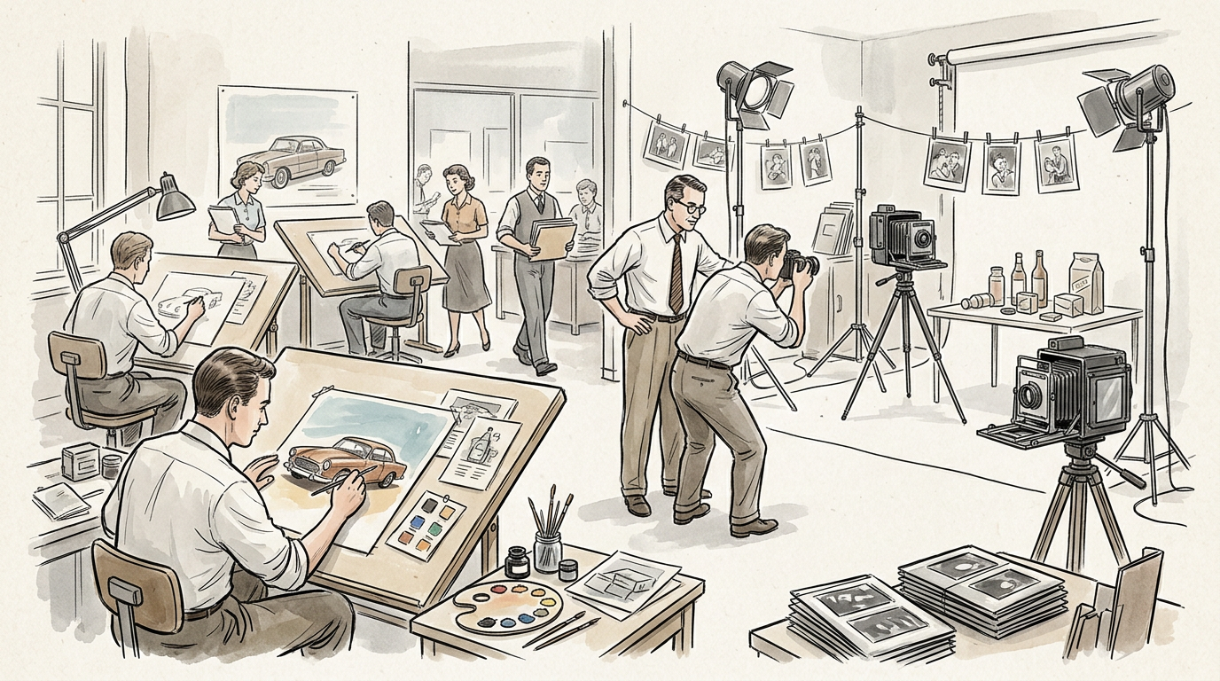
For much of the nineteenth century and well into the twentieth, the visual language of advertising was drawn rather than photographed. Lithographs, engravings, hand-lettered layouts, painted package renderings, and illustrated characters carried the persuasive burden in newspapers, magazines, posters, point-of-sale displays, and outdoor billboards. Photography eventually displaced illustration in many advertising categories, but the change was neither sudden nor complete. It unfolded unevenly across media, products, and production systems, shaped by advances in printing and halftone reproduction, changing beliefs about realism and credibility, the rise of fashion and celebrity culture, and new expectations about what advertising should prove rather than merely suggest.
That transition matters because it altered not only how ads looked, but how agencies worked, how products were staged, how consumers learned to read advertising images, and how advertisers connected visual evidence to persuasion. Photography did not simply offer a new aesthetic option. It reorganized the relationship among copywriting, art direction, production, media buying, and the economics of campaign development. By the middle decades of the twentieth century, photographic advertising had become central to modern brand communication, even as illustration remained important in selected categories and later reemerged as a stylistic choice rather than the industry default.
Before the camera became commercially useful, illustration was advertising’s practical medium
In the early industrial advertising era, illustration dominated for straightforward technical reasons. Newspaper printing was coarse, paper quality was inconsistent, and image reproduction methods before the widespread use of halftones were poorly suited to detailed tonal photographs. Wood engravings and line drawings translated more reliably onto presses than early photographs. Lithography, especially chromolithography in the late nineteenth century, made richly colored posters, packaging labels, trade cards, and point-of-sale materials possible at commercial scale. Firms such as Currier & Ives, poster printers, and packaging houses served a marketplace in which drawn images were not simply preferred but operationally necessary.
Advertising’s visual culture was therefore closely tied to the skills of illustrators, engravers, and print craftsmen. In magazines and general-interest periodicals, line art and engraved images reproduced more predictably than photographs. In posters and outdoor work, large-scale painted or printed designs had to read at distance, which favored bold, simplified forms. On packaging and in store cards, idealized renderings could make products appear cleaner, fuller, more colorful, and more consistent than reality might allow.
This did not mean illustration lacked persuasive force. On the contrary, drawn images were highly adaptable to the needs of early national advertisers. They could dramatize a domestic scene, anthropomorphize a product, depict impossible transformations, or create a branded mascot. They also supported a style of selling that leaned heavily on narrative, sentiment, aspiration, and typified social roles. Illustration helped standardize the visual identity of brands before modern logos and before photographic image libraries made repeatable realism easy to produce.
The halftone process changed what print could do
The crucial technical precondition for photographic advertising was the commercial development of the halftone process, which allowed continuous-tone photographs to be reproduced through patterns of dots that could be printed on relief presses. Experiments in photomechanical reproduction stretched across the nineteenth century, but the broader commercial use of halftones accelerated in the 1880s and 1890s. By the end of the century, major newspapers and magazines increasingly used halftone images, though quality varied by publication, paper stock, and press conditions.
The importance of halftones to advertising history is hard to overstate. Once publishers could reliably print photographs at scale, advertisers had a new representational tool that carried different cultural meanings from engraved illustration. A photograph appeared to record rather than interpret. Even when staged, retouched, or selectively framed, it suggested visual evidence. For some products, especially those tied to appearance, machinery, architecture, food, travel, or celebrity, that mattered.
Yet halftone adoption did not immediately sweep illustration aside. Early photographic reproduction often looked muddy on cheap paper, especially in newspapers. Magazines with better paper and printing standards were more hospitable to detailed photographs. High-end magazines, mail-order catalogs, and some trade publications became important proving grounds. In lower-quality print environments, illustration often remained clearer, more legible, and more glamorous.
The shift was also constrained by workflow. Photographic advertising required not only reproduction technology but photographers, studios, props, lighting methods, darkroom retouching, and tighter coordination between agencies, publishers, engravers, and printers. Illustration already sat inside an established production ecology. Replacing it meant changing institutional habits, not just image sources.
Agencies adopted photography gradually, and often selectively
By the early twentieth century, large agencies were growing more systematized in their handling of national accounts. They developed specialized departments for copy, media, art, and increasingly research. Visual decisions became more formalized as magazines expanded and national brands spent more consistently. In that environment, photography entered advertising first where it solved a practical or persuasive problem better than illustration.
Products that benefited from demonstration were especially likely candidates. Cameras, automobiles, household appliances, cosmetics, apparel, and foods all offered opportunities for photographic proof or sensory approximation. A photograph could show scale, surface, texture, fit, or use. It could present a machine as tangible engineering rather than an artist’s interpretation. It could present a model wearing fashion in a way that aligned the ad with editorial photography and with the authority of the modern magazine.
Still, many agencies and clients retained illustrators because drawn images offered control. An illustrator could idealize the product, simplify clutter, harmonize typography with image, and create scenes that looked expensive even on modest budgets. Illustration also fit the tastes of publishers and readers who were accustomed to pictorial art in magazines. Well into the 1920s and 1930s, prominent illustrators remained central to advertising. Figures such as J.C. Leyendecker, Coles Phillips, N.C. Wyeth, and later Haddon Sundblom were not holdovers from a primitive stage. They were highly valued specialists whose work fit the aspirations and production realities of mass advertising.
The history here is not a clean progression from old-fashioned drawing to modern photography. For decades, most agencies used both. Photography expanded where it could deliver credibility, contemporaneity, and product specificity. Illustration persisted where fantasy, idealization, color control, or production efficiency mattered more.
Magazines were the first major arena of photographic transformation
The most consequential early shift toward photography happened in magazines. Better paper stock, improved gravure and halftone reproduction, and the growth of illustrated periodicals made magazines the medium in which photography could most effectively challenge illustration. Publications devoted to fashion, film, society, and modern living were especially important.
By the 1910s and 1920s, editorial photography had become increasingly sophisticated. Condé Nast publications and other magazine groups invested in fashion photography, portraiture, and layout design. As editorial aesthetics changed, advertising followed. Advertisers wanted ads that felt at home in the magazine environment and borrowed some of its prestige. Photography offered continuity between the ad page and the surrounding editorial world. This mattered in fashion and cosmetics, where magazine culture helped define modern femininity, class display, and standards of visual sophistication.
The relationship between editorial and advertising photography deserves emphasis. Advertising did not replace illustration by inventing a completely separate visual system. It learned from the magazine industries that had already made photography central to modern visual culture. Readers who had grown accustomed to photo-based editorial content, especially celebrity portraits and fashion spreads, were prepared to accept photographic advertising as authoritative, current, and stylish.
The rise of rotogravure also helped. Gravure printing, widely used in magazines and newspaper supplements, could reproduce photographs with richer tonal range than ordinary letterpress halftones. Sunday supplements and mass-circulation magazines accustomed audiences to photographic imagery on a large scale. Advertising could then participate in a broader cultural shift toward the photographic page.
Realism became a selling claim, even when the realism was constructed
Advertisers and agency practitioners increasingly linked photography with truthfulness, modernity, and proof. This was not the same thing as actual objectivity. Commercial photographs were staged, lit, retouched, cropped, and composed to sell. But compared with illustration, they carried a stronger presumption of visual fact.
That presumption aligned with larger changes in advertising practice during the early twentieth century. Agencies increasingly described successful advertising in terms of tested appeals, consumer psychology, salesmanship, and reason-why claims, even when emotional appeals remained central. Photography fit comfortably within that environment because it could function as evidence. In a before-and-after format, in a product demonstration, in a beauty close-up, or in an image of a factory or laboratory, the photograph implied that the consumer was seeing the thing itself.
This matters particularly in categories that traded on efficacy. Patent medicine advertisers and other dubious sellers had long used images, but the professionalizing national-advertising sector, under growing scrutiny from publishers and reformers, had incentives to distinguish itself from obvious fakery. The formation of industry self-regulation, including the work that led to the Audit Bureau of Circulations in 1914 and later the Better Business Bureau movement, did not make photographic advertising inherently honest. It did, however, contribute to a climate in which visual plausibility had commercial value. A photograph could support claims of authenticity, manufacturing scale, sanitation, or endorsement.
At the same time, the industry learned how elastic photographic realism could be. Food was styled. Fabrics were pinned and steamed. Faces were retouched. Composite images and darkroom manipulations were common long before digital editing. Advertising professionals did not discover image construction in the Photoshop era. What changed in the twentieth century was the cultural authority attached to photographic surfaces and the institutional sophistication with which that authority was managed.
Fashion and beauty helped make photography aspirational
One reason photography gained ground was that it solved a problem illustration handled only imperfectly: the display of changing style. Fashion depended on up-to-date silhouettes, drape, texture, and movement. As ready-to-wear clothing expanded, department stores and apparel brands needed images that looked current and desirable. Fashion illustration remained influential, especially in sketch form and in couture contexts, but photographic advertising increasingly aligned fashion with modern consumer culture.
The development of fashion photography between the world wars was decisive. Practitioners including Edward Steichen, George Hoyningen-Huene, Horst P. Horst, Cecil Beaton, and later Richard Avedon and Irving Penn shaped a visual language that advertisers could use. Their work was not interchangeable with routine product photography. It transformed the photograph from mere record into a highly stylized commercial image that could signify elegance, sophistication, and authority. By midcentury, photographic fashion advertising did not win because it was more literal than illustration. It won because it could be both realistic and glamorous at once.
Cosmetics and beauty advertising followed a related path. Close-up photography of faces, skin, hair, and hands became increasingly important as reproduction improved. A drawn face could be idealized, but a photographed face linked the promise of beauty products to visible surfaces that consumers were invited to inspect. This was especially useful when advertisers wanted to imply scientific or demonstrable improvement.
The role of women’s magazines was central here, as they were both media vehicles and cultural institutions shaping consumer expectations. Their advertising pages became laboratories for the integration of editorial fashion imagery, celebrity portraiture, and product selling. Agencies and clients working in these pages learned that photography could carry aspiration more persuasively when audiences wanted signs of social actuality rather than purely imagined elegance.
Celebrity culture strengthened photography’s advantage
Photography also benefited from the rise of celebrity as an advertising asset. Endorsements existed before photographic reproduction became common, but mass-circulation magazines, fan publications, and newspaper rotogravure sections made recognizable faces commercially powerful in new ways. A photographed celebrity could authenticate an endorsement, or at least make it feel immediate.
This development accelerated with the growth of the motion picture industry and the star system. Studios, fan magazines, and portrait photographers helped produce a visual economy in which celebrity identity depended on photographic circulation. Advertisers could borrow some of that value. Whether the endorser was an actress, athlete, socialite, broadcaster, or later a television figure, the effectiveness of the appeal often depended on recognizability. Photography solved that problem better than illustration.
The use of celebrities also reinforced the shift in agency production. Casting, portrait sessions, rights negotiations, and public-relations coordination became more important. The photographic ad increasingly sat at the intersection of advertising, entertainment, editorial media, and publicity. That institutional overlap is one reason photography became so deeply embedded in twentieth-century advertising practice.
Still, celebrity photography did not eliminate illustration overnight. In some cases, illustrators continued to paint idealized celebrity likenesses for glamour campaigns or packaging. But as photographic portraiture became ubiquitous in magazines and publicity materials, audiences expected to see famous people photographically. Illustration could stylize fame; photography could certify it.
Product demonstration changed the visual logic of advertising
Another reason photography replaced illustration in many categories was the growing importance of product demonstration. In household goods, packaged foods, appliances, automobiles, and industrial products, advertisers increasingly wanted to show what a product looked like in use and what specific result it produced.
This shift aligned with broader trends in consumer culture. As distribution widened and national brands competed in crowded categories, many advertisers needed to differentiate products that consumers might not encounter firsthand before purchase. A package, a machine, a kitchen device, or a cosmetic preparation had to be made legible through the ad itself. Photography aided standardization. It showed the same package, same appliance, same automobile model, and same assembly detail across markets.
Automobile advertising offers a clear example. Early auto ads often relied on heroic illustration because roads were poor, dust was difficult, and reproduction quality favored bold graphics. But as car design, body styling, and branded engineering distinctions became selling points, photography grew more useful. It could show contours, interiors, dashboards, trim, and scale with greater specificity. By the postwar period, car advertising made extensive use of photography, even when illustrations still appeared in brochures and showroom materials.
Food advertising also moved toward photographic demonstration as color printing improved. Here the transition was especially revealing. Illustration could make food look abundant and idealized, but photography promised visibility of actual dishes, ingredients, serving suggestions, and package forms. The challenge, of course, was that food was difficult to photograph attractively under midcentury production conditions. This difficulty helped professionalize food styling, set design, and tabletop photography. An entire craft infrastructure emerged because advertisers increasingly preferred photographic proof to painted suggestion.
Outdoor advertising changed more slowly because its technical demands were different
The movement from illustration to photography happened more slowly in outdoor advertising. Billboards had to be seen quickly and from distance. For much of their history, hand-painted boards and posterized designs rewarded simplification over tonal subtlety. A detailed photograph reproduced badly at large scale could lose impact. Outdoor’s production economics also favored standardized poster formats and later silk-screen and painted techniques that worked well with strong shapes and limited palettes.
As a result, illustrated outdoor remained common long after magazines had embraced photography more fully. Poster artists and layout specialists knew how to command attention with simplified figures, dramatic color, and exaggerated perspective. National billboard campaigns often relied on artwork that was legible in motion and adaptable across plant locations.
Photography expanded in outdoor when printing and photographic enlargement methods improved and when advertisers sought continuity across campaigns running simultaneously in magazines, point-of-sale, and later television tie-ins. By the mid-twentieth century, photo-based posters became increasingly practical, especially with better offset and screen-print workflows and, later, photo enlargements mounted onto billboard surfaces. Even then, advertisers often retouched, airbrushed, or graphically simplified photographic images to preserve readability. Outdoor did not merely adopt magazine-style realism. It developed a hybrid visual language in which photographs were often treated as raw material for large-format graphic design.
This is a useful reminder that media characteristics mattered. Photography did not replace illustration everywhere at the same pace because each medium imposed different viewing conditions, production constraints, and cost structures. What worked on coated magazine stock did not automatically work on a roadside board.
Color photography expanded the field, but black-and-white remained important for decades
A common retrospective simplification is that photography “won” when color photography arrived. The historical record is more complicated. Color photography had been commercially available in various forms well before it became routine in advertising, and color printing itself had long been possible through lithographic methods. The issue was not the existence of color but the cost, consistency, and quality of reproducing color photographs at scale.
Black-and-white photography remained highly effective for many categories well into the mid-twentieth century, especially in newspapers, trade advertising, and prestige magazine campaigns where tonal control could communicate seriousness or elegance. Some of the most influential photographic advertising of the 1950s and 1960s was monochrome.
What color changed was the range of categories in which photography could directly compete with illustration on sensory grounds. Food, beverages, fashion, interiors, and packaged goods all benefited from more plausible color representation. As four-color process printing spread and improved, and as agencies and printers became more adept at color separation and proofing, the photographic ad became more versatile. Color also mattered for brand consistency. Packages, labels, fabrics, and cosmetics shades could be shown more recognizably, though never perfectly.
The economics were significant. Four-color magazine advertising was expensive, and color photography added production complexity. Large advertisers could absorb these costs first. As a result, the shift from illustration to photography also tracked inequalities in budget and category maturity. Premium brands and national accounts often led the transition, while smaller advertisers retained illustration longer because it was cheaper, more forgiving, or simply sufficient.
The postwar era made photographic advertising the modern norm
By the late 1940s and 1950s, photography had become the dominant visual mode in many major advertising sectors, particularly national magazine advertising. Several forces converged. Consumer markets expanded after World War II. Magazine circulation remained strong. Improvements in cameras, lighting, film stocks, studios, and printing made photographic production more dependable. Art direction matured as a profession. And modernist design encouraged cleaner layouts in which photographs, headlines, and white space worked together more systematically than in earlier cluttered, text-heavy pages.
This was the era in which photographic advertising became closely associated with professional modernity. Agencies invested in art directors who could integrate image and type with greater control. Photographers became visible collaborators in campaign development. The best-known examples are often tied to the so-called creative revolution of the 1950s and 1960s, especially work from agencies such as Doyle Dane Bernbach. Campaigns like Volkswagen’s “Think Small,” art directed by Helmut Krone and written by Julian Koenig, used photography not simply as literal description but as a conceptual device. The Beetle’s small photographed presence on the page was part of the argument. It conveyed honesty, wit, and anti-bombast through photographic understatement.
That campaign was important not because it suddenly introduced photography into advertising, which it did not, but because it demonstrated how photography could support a new relationship between visual scale, tone of voice, and brand truthfulness. The image looked less like illustrative sales rhetoric and more like documentary evidence framed by intelligent design. Many later histories treat such work as a rupture. It is better understood as a culmination of decades in which photography had gradually become the medium through which advertisers could signal candor, contemporaneity, and stylistic restraint.
Television did not replace print photography, but it reinforced photographic ways of thinking
Television introduced moving images into mainstream advertising on a scale that no print medium could match, yet its effect on still advertising was not to displace photography. Instead, television reinforced photographic habits across campaigns. Once brands were producing filmed demonstrations, celebrity appearances, product close-ups, and lifestyle scenes for broadcast, their print and outdoor work often borrowed from the same visual logic.
Television also changed expectations about realism. Consumers increasingly encountered products through moving-image demonstrations and human performance rather than through drawn symbolic scenes. Print advertising that still relied heavily on illustration could appear old-fashioned in categories where television had normalized visual proof, especially household products, packaged goods, beauty, and appliances.
The industrial structure of campaigns changed as well. Integrated campaigns across television, magazines, newspaper supplements, in-store materials, and outdoor encouraged the use of common photographic assets or at least consistent photographic styling. A celebrity shot for a television commercial could be repurposed for a magazine ad. Product photography used in packaging or point-of-sale could echo on-air demonstration shots. The campaign image system became more modular.
This did not mean television made every print ad look like a film still. But it did cement a broader visual culture in which photographic and cinematic realism became advertising’s central representational mode. Illustration remained strong in children’s advertising, mascots, some packaged goods, technical cutaways, humor, and seasonal imagery, but it increasingly operated as an exception, a specialty, or an overt stylistic decision.
Professional roles changed along with the images
The replacement of illustration by photography in much of advertising also reshaped agency labor. Earlier print advertising often depended on staff artists or freelance illustrators working from rough concepts supplied by copywriters and account teams. Photographic advertising required a more elaborate production chain.
Art directors became more powerful because photographic work demanded choices about casting, wardrobe, props, set design, cropping, sequencing, retouching, and layout integration. Photographers, once hired largely as vendors, sometimes became creative partners whose visual style influenced the campaign itself. Stylists, makeup artists, model agencies, location scouts, food stylists, and retouchers entered the commercial process as specialists. Reproduction houses and color separators took on a larger role. The agency became not just a buyer and writer of space but an orchestrator of image production.
These changes also affected budgeting and scheduling. A custom illustration could be expensive, but photographic shoots introduced recurring costs that scaled with complexity. Talent fees, studio rental, processing, and reshoots became ordinary planning concerns. With celebrity talent or major product shoots, legal and contractual issues grew more important. The shift to photography thus belongs not only to visual culture but to the business history of agencies and production services.
This evolution contributed to later developments in commercial photography as its own industry. By the late twentieth century, leading advertising photographers had recognizable signatures and negotiated substantial fees. Their emergence reflected the degree to which photography had become not merely a technical substitute for illustration but a premium creative resource.
Illustration never disappeared, and its survival clarifies the real history
Because photography became so dominant in many sectors, later accounts sometimes describe illustration as if it were simply superseded. That overlooks both historical continuity and strategic persistence. Illustration remained valuable where advertisers wanted fantasy, simplification, warmth, humor, or insulation from literal scrutiny. It remained central to mascots, logos, package characters, editorial-style storytelling, technical diagrams, and youth-oriented or whimsical campaigns. Midcentury advertisers still commissioned major illustrators, and some of the period’s most recognizable brand images, including Santa Claus imagery associated with Coca-Cola through Haddon Sundblom, remained painted rather than photographed.
The persistence of illustration reveals that the historical issue was never realism versus unreality in any absolute sense. It was fit between medium, message, cost, audience expectation, and cultural meaning. Photography came to dominate where it better answered a modern advertiser’s needs for evidence, immediacy, celebrity recognition, product specificity, and alignment with photographic editorial and broadcast culture. Illustration endured where selective invention and graphic control remained advantageous.
In later decades, especially from the late twentieth century forward, illustration would periodically return as a way to resist photographic sameness, create distinctive branding, or signal craft. But by then the baseline had changed. Illustration was no longer advertising’s default visual language. It had become one option among many in an industry organized around photographic and, later, digital image production.
Why the shift mattered
The replacement of illustration by photography in much
Leave a Reply