
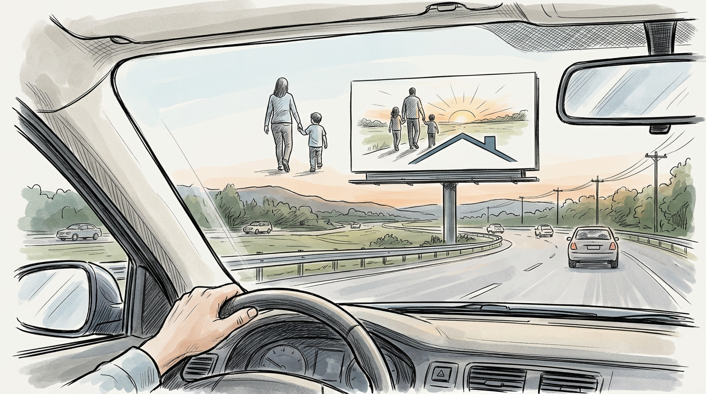
Out-of-home advertising asks creative teams to solve a communications problem under unusually strict physical conditions. A billboard, transit shelter, digital roadside unit, wallscape, airport panel, or place-based screen may be large and public, but size does not create time. In many placements, audiences encounter the message while moving, at a distance, amid visual clutter, and with other priorities competing for attention. The practical consequence is straightforward: out-of-home rewards simplicity not because the medium is unsophisticated, but because its viewing conditions are unforgiving.
That point is easy to reduce to cliché. Industry shorthand has long favored rules about a certain number of words or a brief “glance” standard. Those heuristics can be useful, but they are not the real lesson. Simplicity in out-of-home is not merely minimal copy. It is disciplined message hierarchy built for speed of perception. The work has to tell viewers what matters first, what can be absorbed second, and what can be omitted altogether. When it succeeds, the medium can create broad reach, strong memory structures, and high public visibility. When it fails, the audience may see the unit without processing the brand, offer, or intended meaning.
That tension makes out-of-home one of advertising’s purest strategic and creative tests.
Why the medium compresses communication time
The Out of Home Advertising Association of America describes the category broadly to include traditional and digital placements in public environments, from roadside billboards to transit, street furniture, airports, retail environments, and other place-based formats. What these environments share is not a common screen size or production method, but a common audience reality: people are usually on their way somewhere else.
That matters because exposure and comprehension are not the same thing. An out-of-home unit may generate an opportunity to see, but the ad still has to be cognitively legible under real-world conditions. Drivers cannot study. Pedestrians may glance and look away. Transit riders may be distracted by crowds, phones, navigation tasks, weather, or fatigue. Airport travelers may have more dwell time, but also face a dense field of signs, directions, retail messaging, and public information competing for visual processing.
This is why the medium depends on immediate grasp. In many formats, the decisive interval is not the total amount of time a unit is visible in the environment, but the shorter period in which a viewer can actually attend to and decode the ad. Media owners, agencies, and researchers have long worked with the idea that out-of-home often operates in seconds rather than sustained reading time. Geopath, the audience measurement organization for out-of-home in the United States, builds audience estimates from visibility and circulation data precisely because location, angle, speed, and noticeability shape whether a unit can be seen at all. Those variables are not secondary. They are the medium.
Viewing time is a creative constraint, not just a media variable
Creative teams often discuss viewing time as if it were a buying issue solved by format selection. In practice, it is also the core brief for the work itself.
A roadside billboard on a high-speed route imposes a harsher communication limit than a transit shelter on a walkable urban block. A digital screen in a venue may offer repeated exposures, but each exposure can still be partial, obstructed, or peripheral. The work must therefore be engineered to survive fragmentary attention.
That shifts the creative question from “What do we want to say?” to “What can be understood almost instantly?” The answer is usually narrower than clients first expect. Most out-of-home units can communicate one primary proposition well, perhaps supported by one reinforcing cue. They are not efficient containers for multiple claims, layered explanations, legal language, product detail, or tonal ambiguity.
This is not a failure of imagination. It is respect for perception. When advertisers overload the unit, they force the audience to choose what to ignore. Often the ignored element is the one the advertiser most needed to convey.
Professionals sometimes describe strong out-of-home as “simple,” but “single-minded” may be more precise. The medium favors work built around a dominant idea that can be perceived before it is fully read.
Distance changes what counts as readable
Out-of-home is one of the few major advertising media where viewing distance fundamentally shapes copywriting and design. On a phone, a line of text may be legible at arm’s length. On a billboard or transit format, the same line may collapse into texture if letterforms are too small, too condensed, or too low-contrast relative to the background.
Distance affects more than type size. It changes the relative usefulness of every visual element. Fine detail, secondary imagery, subtle tonal transitions, intricate illustrations, and dense product shots often disappear. What remains are bold shapes, strong color contrast, familiar symbols, and short language units that can be recognized quickly.
That is why the best out-of-home often relies on distinctive brand assets rather than explanatory copy. A recognizable package silhouette, a signature color system, a known logo, a memorable character, or a highly familiar product form can carry meaning at distance before the text is fully processed. Byron Sharp and the Ehrenberg-Bass Institute have argued extensively for the value of distinctive brand assets in building mental availability. Out-of-home is one of the clearest operational demonstrations of that principle. In fast-view conditions, brands benefit when consumers can identify them from partial cues.
The practical lesson for advertisers is not simply “make the logo bigger.” A larger logo cannot rescue a confused hierarchy. Instead, the entire composition should help the viewer move from cue to meaning with minimal effort. Brand identifiers need to be present early in the perceptual sequence, not merely appended after an oversized image or a line of copy that absorbs all the visual weight.
Scale is powerful, but not self-explanatory
The dramatic physical scale of many out-of-home formats can tempt advertisers to mistake prominence for communication. Large units dominate space, but they do not guarantee comprehension. In some cases, scale can even expose weaknesses in the idea. A thin concept enlarged to architectural size does not become more persuasive. It merely becomes more public.
Scale works best when it amplifies a clear visual relationship. Oversized product imagery, a bold typographic statement, a visual metaphor readable from afar, or a brand asset with immediate recognition can all benefit from public scale. But scale punishes clutter. A composition that might feel merely busy on a laptop screen can become unreadable when spread across a billboard because the audience cannot take in all the elements in sequence.
This is one reason award juries and practitioners alike often admire out-of-home work that appears deceptively spare. Restraint allows scale to do useful work. Negative space can increase recognition. A single oversized object can turn into a landmark. A short line can become memorable because it is not fighting six other messages for attention.
The medium’s public nature also means that scale can create social visibility beyond immediate exposure. Consumers photograph, share, and discuss notable installations. Press coverage may amplify ambitious executions. Yet the unit still has to function in the first instance as out-of-home. Work designed primarily for photographed afterlife can neglect the passerby standing beneath it. If the ad only makes sense once framed for Instagram, the core medium has been underserviced.
Location is not a backdrop. It is part of the message system.
In out-of-home, media context has direct creative consequences. A message that works in one location may fail in another because route, speed, audience mindset, and surrounding clutter change how the ad is read.
A commuter corridor invites different choices than a shopping district. An airport concourse supports different message density than a roadside bulletin. A transit shelter near point of purchase can credibly present directional or promotional information that would be wasted on a highway. Place-based digital screens in gyms, elevators, or office buildings may allow more sequential storytelling because audiences encounter them repeatedly in constrained environments. But even there, the ad competes with habit and distraction, so clarity still matters.
Location can also add meaning through relevance. Weather-triggered creative, neighborhood-specific copy, directional language, and contextual references can all strengthen salience when used carefully. Digital out-of-home has expanded these possibilities. Programmatic and dynamic capabilities allow advertisers to vary copy by time of day, local conditions, inventory levels, sports scores, or other data inputs. Yet dynamic execution does not eliminate the simplicity requirement. In fact, it raises the bar. If copy, data, and design are constantly changing, the hierarchy must be even cleaner so the audience knows what to process first.
There is a professional temptation to equate contextual sophistication with strategic sophistication. Sometimes the opposite is true. The smarter contextual execution is often the one that adapts only one variable while preserving clear brand recognition and a stable visual system across placements.
Movement complicates attention for both drivers and pedestrians
Out-of-home audiences are often moving, but the more important issue is that movement changes how visual information is sampled. Drivers view signage through a sequence of approach, recognition, and recession. Pedestrians scan irregularly, stop and start, and may notice only part of a message before being interrupted by a crossing signal, storefront, or crowd. Transit audiences may encounter ads through windows, station platforms, escalators, or passing vehicles, each with different sightlines and durations.
The creative implication is that out-of-home messages should remain intelligible even when seen incompletely. A headline whose punch line depends on the final word may never land if that final word is missed. An image requiring prolonged inspection may never resolve. A design that withholds branding until the lower corner may be seen but not attributed.
Motion also matters within digital out-of-home units themselves. The growth of digital inventory has introduced animation, countdowns, changing frames, and rotating messages. Used carefully, motion can attract notice. Used poorly, it fragments comprehension. The first frame must often do most of the branding work because viewers may not see the full loop. The Creative Guidelines published by major media owners and trade bodies frequently stress this point: digital out-of-home should not assume captive viewing. A sequence is not automatically a story.
For roadside digital specifically, regulation reflects the same concern. The Federal Highway Administration provides guidance on digital billboards under the Highway Beautification Act framework, and state and local rules often address dwell time, transitions, brightness, and animation limits. While regulations vary by jurisdiction, the underlying professional issue is consistent: public-facing advertising in transportation environments must account for safety, visibility, and distraction.
Message hierarchy is the real craft discipline
If simplicity is the medium’s demand, hierarchy is the method for meeting it.
Every out-of-home execution answers a sequence of perceptual questions. What is noticed first? What is understood next? When does the brand become identifiable? What remains after the viewer looks away? Strong work manages that sequence deliberately.
In practice, hierarchy often means prioritizing a few core elements:
- A dominant visual or typographic anchor that can be noticed immediately.
- A short verbal idea, if words are necessary, built for fast reading and easy recall.
- Clear brand attribution through distinctive assets, logo, product form, or another recognizable cue.
- Only the amount of secondary information the format and location can realistically support.
This is where many campaigns become weaker in adaptation than in concept. A campaign developed for film, social, or print may arrive at out-of-home as a compressed version of an existing asset rather than an idea rebuilt for the medium. The result is often a poster frame carrying too many obligations: headline, subhead, product description, call to action, URL, legal copy, image montage, and oversized tagline. Nothing is technically absent, but little is functionally absorbable.
Good out-of-home adaptation is not about shrinking the campaign into a rectangular space. It is about identifying the irreducible meaning of the campaign and expressing that meaning through the fewest possible cues.
Creative directors and account teams sometimes resist that reduction because it feels like strategic loss. In many cases, it is strategic clarification.
Environmental context determines whether complexity survives
The same ad can perform differently depending on environmental clutter, architecture, lighting, weather, and adjacent signage. Out-of-home is never viewed in a neutral frame. It is encountered in streetscapes, stations, terminals, highways, retail zones, campuses, and venues already saturated with information.
That environmental context influences what kinds of complexity are tolerable. In a low-clutter setting, a slightly longer line or more nuanced image may still register. In a dense urban corridor with layered storefronts, traffic signs, digital screens, and street activity, the ad may need to compete less by saying more and more by organizing itself more forcefully than everything around it.
Color and contrast are especially important here. A palette that aligns beautifully with brand guidelines may still underperform outdoors if it blends into sky, concrete, foliage, or surrounding retail visuals. Likewise, photographic imagery that works in controlled print or digital environments may lose impact when ambient light and distance flatten detail.
Environmental context also shapes tone. Public advertising is consumed in shared civic space, not an individualized feed. Humor, provocation, political implication, sexuality, and social commentary can attract attention, but they also generate broader and less predictable audience response because the medium is unavoidable and collective. Advertisers therefore have to consider not only whether a message can be seen, but how it will be interpreted by multiple publics in the same physical setting.
That public character is part of out-of-home’s appeal. It is also why the medium demands professional discipline.
What simplicity looks like in practice
Simplicity in out-of-home is often misunderstood as aesthetic minimalism. The profession should treat it more rigorously. Simplicity can take several forms, depending on the brief.
Sometimes it is verbal simplicity: a few words with a clear semantic punch. Sometimes it is visual simplicity: one object, one contrast, one joke, one impossible-to-miss cue. Sometimes it is structural simplicity: a campaign system that keeps the same visual grammar across many units so audiences learn how to read it quickly. Sometimes it is brand simplicity: relying on already-established assets so the ad can do less explanation and more reinforcement.
This distinction matters because not every category has the same burden of explanation. A mature consumer brand with strong recognition can lean heavily on memory structures. A new entrant may need clearer naming and category signaling. A local service advertiser may need location and offer clarity more than visual theater. A public service campaign may need urgency and actionability, but still must avoid overloading the unit with instructional text that cannot be read in time.
The best agencies and in-house teams treat these as design and strategy problems, not stylistic preferences. They test the ad against the actual conditions of viewing. Can a driver process the main idea on approach? Can a pedestrian understand the point at half attention? Is the branding visible early enough? Does the ad remain intelligible if only half the copy is read? What survives in memory an hour later?
Those questions are more useful than any universal word-count rule.
Measurement supports the case for clarity, but with limits
Out-of-home measurement has become more sophisticated, especially as location data, mobility modeling, and digital proof-of-play systems have improved. Geopath provides audience measurement standards for U.S. out-of-home media, including metrics designed to estimate not only circulation but likelihood of visibility. Advertisers can combine those data with brand lift studies, search response, mobile visitation analysis, retail trends, and broader econometric models.
Still, professionals should be careful with claims of effectiveness. Out-of-home can contribute to awareness, mental availability, route-to-store reinforcement, launch visibility, and campaign reach. It can work especially well in combination with other channels because it creates public signals that reinforce messages consumers also encounter on mobile, video, audio, search, or retail media. But proving direct sales causality for a single unit or campaign is not always straightforward. Exposure may correlate with downstream behavior without fully explaining it.
That uncertainty makes creative fundamentals even more important. If attribution is complex, advertisers should not add avoidable creative friction. Distinctive cues, fast comprehension, and location-appropriate execution increase the chances that measured exposure becomes meaningful communication.
Industry research has also consistently found that out-of-home can be effective as a reach and reminder medium when integrated with broader campaigns, but the role it plays is specific. It is often less about delivering a full argument than about making the brand or proposition mentally and physically present in the market. Simplicity is therefore aligned with the medium’s contribution. A concise and memorable message is easier for the channel to carry than a detailed persuasive sequence better suited to longer-form media.
Why agencies and clients still overcomplicate the work
If the case for simplicity is so clear, why do so many out-of-home units still feel overloaded?
Part of the answer lies in approval dynamics. Out-of-home is highly visible to client stakeholders, senior leadership, retail partners, franchise networks, and legal reviewers. Because the unit appears in public and often at large scale, many parties want their priority included. The board becomes a negotiation surface rather than a communication device.
Another reason is campaign inheritance. Out-of-home is frequently treated as a required adaptation of a larger integrated campaign instead of a medium with its own logic. The core television or digital idea may be excellent, yet the translation fails because the narrative relies on pacing, dialogue, multiple shots, or interaction that the static or short-loop format cannot reproduce.
There is also a cultural bias within some organizations toward saying more as a sign of value. A sparse billboard can make clients nervous because it looks as though space has been “wasted.” In reality, the empty space may be doing the most important work by making the message legible.
Experienced agencies address these issues upstream. They explain the medium’s perceptual constraints before creative review. They separate non-negotiable information from desirable information. They defend hierarchy as strategy, not decoration. And they use mockups, distance checks, route simulations, and real-environment previews to move the discussion from taste to function.
The discipline behind memorable public advertising
Out-of-home remains one of advertising’s most visible media because it places brands into shared physical life. That public presence can create fame, routine reinforcement, directional utility, and cultural conversation. But the medium earns those benefits only when the work respects the speed and complexity of the environment in which it is seen.
Viewing time, distance, scale, location, movement, hierarchy, and context are not isolated craft considerations. Together they determine whether an out-of-home ad is merely present or actually communicative. Simplicity is the professional response to those conditions. Not simplistic thinking, and not creative timidity, but disciplined reduction in service of immediate understanding.
For advertisers, agencies, and in-house teams, that is the enduring lesson of the medium. Out-of-home is powerful because it is public, unavoidable, and often large. It is effective when it is also instantly clear.
Leave a Reply