
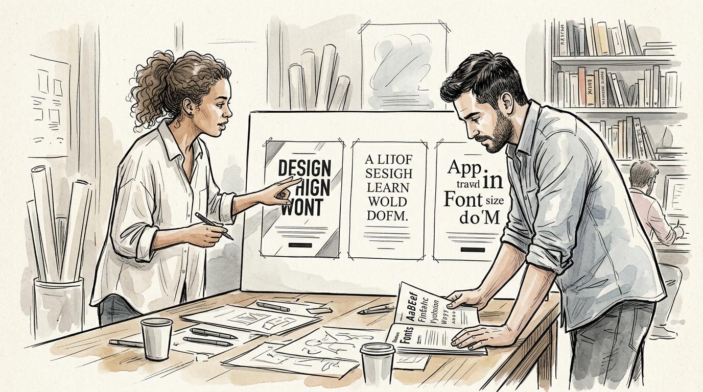
Typography is often discussed in advertising as if it were a matter of taste. Teams debate serif versus sans serif, large versus restrained, expressive versus neutral, modern versus classic. Those choices do matter, but not because one style is inherently better than another. Typography contributes to advertising when it helps a message be understood, felt, remembered, and recognized in the context in which people actually encounter it.
That makes type a strategic tool before it is a stylistic one. It organizes attention. It sets the pace of reading. It signals brand personality. It shapes whether copy feels authoritative, intimate, energetic, technical, luxurious, plainspoken, urgent, or playful. It can support a campaign idea by making the idea easier to grasp and more distinctive to recall. It can also work against the idea when expressive type becomes difficult to read, culturally mismatched, or so visually dominant that the audience notices the lettering more than the message.
For creative teams, the practical question is not whether typography should be noticeable. The question is what the type needs to do.
Typography is part of the idea, not just the finish
In strong advertising, typography does not arrive at the end as decoration after the “real” concept is done. It helps express the concept. A direct-response email, a transit poster, a luxury print ad, a healthcare landing page, a retail price promotion, and a short social video all ask type to solve different communication problems. The same words can feel completely different depending on how they are set, sequenced, sized, and spaced.
This is where creative strategy and execution need to stay connected. Strategy defines what the communication must accomplish and what the audience should understand or do. Typography helps determine whether that intent survives contact with the medium.
If the strategic task is reassurance, typography that feels stable, legible, and measured may do more work than copy revisions alone. If the task is to dramatize speed or disruption, a rigid and overly formal typographic system may undercut the concept. If a campaign depends on premium cues, a dense block of poorly spaced text can make even strong writing feel cheap or careless. None of these are merely aesthetic issues. They affect comprehension, tone, and credibility.
Design history offers a useful reminder here. Typographic choices have long been bound up with function. Massimo Vignelli argued repeatedly that typography should communicate with clarity and discipline, not just style for style’s sake, a principle evident across his work for public information systems and corporate identity programs. In advertising, the variables are broader and often more expressive, but the underlying standard remains relevant: type must help communication work.
Hierarchy is typography’s first contribution
Most advertising is received under conditions of limited attention. Audiences glance at outdoor boards from a moving car, scroll past mobile ads, skim emails between meetings, or split attention between a second screen and a video ad. In those conditions, typographic hierarchy determines what gets seen first, what gets understood second, and what can be ignored without harming comprehension.
Hierarchy is not simply making the headline big. It is the relationship among headline, subhead, body copy, product details, offer language, disclaimers, captions, calls to action, and brand cues. It includes weight, scale, placement, contrast, spacing, and rhythm. Good hierarchy allows different depths of reading. Someone who gives an ad two seconds should still get the main message. Someone who gives it twenty seconds should find the supporting proof and next step without friction.
This is especially important in multi-objective advertising, where teams often try to communicate too much at once. When an ad includes a product claim, a price point, a promotional deadline, a web address, legal language, partner logos, and a campaign line, hierarchy becomes the only way to prevent collapse into visual noise. The type system has to reveal priorities that the brief should have clarified earlier.
Weak hierarchy usually reflects a strategic problem before it becomes a design problem. If stakeholders cannot agree on the single most important takeaway, typography gets asked to perform a rescue operation. It rarely can.
Tone and personality live in the details of type
Type contributes personality without needing to become theatrical. A typeface, its weight, its spacing, and the way it is paired with images and copy all tell the audience how to hear the message in their heads.
This matters because much advertising depends on implied voice. A joke lands differently in a tightly compressed all-caps sans serif than it does in an open, conversational serif. A technical claim can feel more credible when the typography supports precision and order. A youth-oriented campaign can lose energy if the type system feels inherited from corporate reporting. At the same time, forced “coolness” can make brands look like they are borrowing a tone they have not earned.
Typography is especially important when verbal style is intentionally restrained. Many successful campaigns use plain language, short statements, or product-centered claims. In those cases, the type does significant tonal work. It decides whether the plainness feels confident, premium, blunt, democratic, or dull.
The relationship between typography and brand personality is visible in identity systems that extend into advertising. Coca-Cola’s Spencerian script, for example, is not just a logo treatment. It carries heritage, continuity, and immediate recognition across packaging and communications, helping even brief or image-led executions remain unmistakably branded. The company’s own brand history documents how central that script has been to recognition over time. That does not mean every brand needs a custom script or a heritage cue. It means distinctive typographic assets can do meaningful brand work when they are consistently and appropriately used.
Readability is not the enemy of expression
Creative teams sometimes frame readability as a conservative concern that limits originality. In practice, readability is what gives typography permission to be expressive. If people cannot decode the message, the expression has failed its job.
Readability is not a single universal standard. It changes by audience, medium, size, lighting conditions, screen quality, motion, viewing distance, and reading duration. Type on packaging viewed in the hand behaves differently from type on airport signage. Mobile interfaces require different decisions than magazine spreads. Subtitles in social video must survive silent autoplay, small screens, and fast scrolling. Outdoor type must communicate at speed and distance. What is perfectly legible in a design presentation on a large calibrated monitor may fail badly in the real environment.
This is one reason unusual typography becomes a liability so quickly in advertising. An unconventional type style may be appropriate if it strengthens the concept and remains easy enough to read in context. But novelty in letterform, distortion, hyper-tight spacing, low contrast, or over-layered composition often imposes extra cognitive work on the audience. That work may be acceptable in an album package, an exhibition poster, or a fashion editorial where prolonged attention is part of the experience. It is often a poor bargain in an ad competing for seconds of attention.
The principle also has accessibility implications. The World Wide Web Consortium’s Web Content Accessibility Guidelines emphasize sufficient contrast, scalable text, and readable presentation because these choices materially affect whether people can perceive and use content. While WCAG is not an advertising style guide, the broader lesson applies: typographic decisions shape access, not just aesthetics. When a campaign depends on tiny light-gray copy, ultra-condensed text, or motion graphics that outpace reading, the creative issue is not merely design preference. It is communication failure for part of the audience.
Typography controls pacing
Advertising is temporal even when it is static. A print ad or webpage does not literally move, but it still unfolds in sequence. Typography determines part of that sequence by controlling pace.
Short lines can make copy feel brisk or fragmented. Long lines can feel expansive, literary, or exhausting depending on context. Generous leading can create calm and sophistication; too much can make reading feel disconnected. Tight spacing can create urgency or claustrophobia. Repetition of typographic forms can create cadence across a campaign. In film, social video, and digital display, kinetic typography can intensify emphasis, synchronize with sound, and structure narrative beats, but it can also become noise if motion outruns comprehension.
This is why typography belongs in discussions of storytelling, even when the ad is not conventionally narrative. Type can withhold, reveal, emphasize, interrupt, or accelerate. A sequence of supers in a film can create argument, irony, or contrast with what is happening on screen. On a landing page, typography can guide a reader from problem to benefit to proof to action. In a long-copy print piece, it can create an inviting path into denser information that might otherwise feel forbidding.
Pacing also affects persuasion. If a claim requires proof, the typography should not rush the audience past the evidence. If a retail offer requires urgency, the system should make deadlines and calls to action impossible to miss without turning the page into clutter.
Recognition depends on consistency as much as distinctiveness
Advertising often asks typography to do two things that can seem in tension: help each execution feel fresh and help the campaign feel recognizably from the same brand. Distinctiveness matters, but consistency is what allows distinctiveness to accumulate.
Recognition can come from custom typography, a proprietary headline style, disciplined use of a small type palette, or a recurring structural pattern in layouts. The exact method matters less than the logic behind it. When audiences repeatedly encounter the same typographic signals linked to the same advertiser, those signals become part of memory structure.
This is one reason typographic systems are often more valuable than isolated typographic gestures. A system gives campaign teams a repeatable framework for adaptation across formats, markets, languages, and production partners. It also helps prevent a familiar problem: each new execution gets “improved” by different stakeholders until the brand voice fractures.
Helvetica’s long commercial life is instructive here, not because it is universally ideal, but because its neutrality and reproducibility made it useful in identity and information systems across media for decades. MoMA’s documentation of its history notes its global adoption after its 1957 release in Switzerland. In advertising, that same neutrality can be either an asset or a weakness. It can allow a message or image to take center stage, but it can also produce generic work when a brand needs more specific personality. The lesson is not to use Helvetica or avoid it. The lesson is that recognizability comes from fit and disciplined use, not from chasing whatever type style currently signals design awareness.
Copywriters and art directors solve typography together
Typography is often treated as the art director’s territory, but in practice it is inseparable from copywriting. Copy length, syntax, rhythm, punctuation, capitalization, and emphasis all affect how type performs. The headline is not one thing and the typesetting another. They are a combined reading experience.
A concise line with strong stress patterns may deserve large, spacious treatment. A more explanatory proposition may need subheads, pullouts, or modular structure. Legal necessity can change how persuasive language is framed. In social formats, the first line may need to work both as visual text and as spoken dialogue. A script built around on-screen text has to account for reading speed, not just word choice.
The best copywriter-art director teams test alternatives early. They do not assume the line that sounds best in a script document will look best in layout, and they do not assume a visually elegant treatment can compensate for vague language. They sketch, set rough comps, and evaluate whether the writing and the type are reinforcing each other.
This collaborative approach becomes even more important when campaigns travel across media. A line that works beautifully in outdoor may be too thin for radio, too generic for search, too abrupt for email, or too unexplained for a landing page. The typographic system can help create continuity, but it cannot fix a message that lacks enough substance for certain channels. Conversely, channel-specific copy changes should still respect the same typographic logic so the campaign does not splinter into unrelated experiences.
Medium changes what good typography looks like
No discussion of type in advertising is complete without acknowledging that medium fundamentally changes execution.
In outdoor advertising, legibility at distance is decisive. The Out of Home Advertising Association of America has long emphasized clarity, brevity, and visibility as practical requirements for the format. Typography here is less about nuanced reading and more about instant recognition and retention. A beautiful condensed face with subtle stroke contrast may fail where a simpler, heavier treatment succeeds.
In print, there is more room for reading depth and typographic nuance, but context still matters. Magazine ads compete with editorial environments that may themselves be highly designed. Newspaper inserts must survive lower production quality. Direct mail can use typographic structure to create personal relevance, but it can also slide into distrust if the urgency cues feel manipulative.
On mobile screens, the margin for typographic error is small. Small sizes, ambient distraction, and variable rendering make hierarchy and contrast critical. Email and landing pages add another layer: type has to work inside templates, browsers, operating systems, and responsive frameworks that may alter line breaks and spacing in unpredictable ways. Production realities are not afterthoughts here. They directly shape creative decisions.
Video and motion design introduce timing. On-screen text that appears for two seconds may be fine in an edit suite and unreadable in the feed. The problem is rarely just that the audience “wasn’t paying attention.” The problem is that the typography assumed ideal viewing conditions that do not exist.
Production constraints are creative constraints
Typography is unusually sensitive to production. Paper stock, ink spread, digital rendering, compression, subtitle safe areas, animation software, screen brightness, and platform interfaces all affect the final result. A carefully chosen typeface can appear crude if output conditions are poor. A subtle weight difference can disappear in low-resolution display inventory. Licensing restrictions may limit the use of certain fonts across international markets or platforms. Variable fonts may offer flexibility, but they require technical understanding to use well.
This is why production teams should be involved early when typography carries major conceptual weight. If the campaign depends on a particular custom look, the team needs to know whether it can be reproduced consistently at speed and scale. If a retail network uses local printers with uneven quality control, the type solution should be robust enough to survive that environment. If a campaign is localized into multiple languages, the original typographic idea may need adaptation rather than strict replication.
Too often, typography is approved in ideal mockups and compromised in rollout. That creates a gap between concept and public experience. Creative leadership can reduce that gap by insisting on prototype review in realistic formats and by treating implementation details as part of craft, not production trivia.
Feedback on typography should not collapse into personal preference
Type attracts opinion. Clients, marketers, and internal reviewers may all have strong reactions to what looks “clean,” “premium,” “bold,” or “dated.” Some reactions are useful. Many are shorthand for concerns that should be stated more precisely.
The most productive feedback on typography identifies the communication problem rather than prescribing a stylistic fix. “The pricing does not stand out enough for a retail ad.” “The headline feels harder to read on mobile than it did in presentation.” “The type treatment makes the healthcare message feel less trustworthy than intended.” “The body copy looks dense enough that many readers may skip the proof points.” Those comments can be evaluated against objective, audience, medium, and brief.
By contrast, “Use a more modern font” or “Make it pop” may only send teams into aesthetic guesswork. Modern for whom? Pop relative to what? In service of which objective?
This is an area where creative leaders can improve review culture. They can ask decision-makers to distinguish among readability, hierarchy, tone, brand fit, and novelty. They can also make sure typography is evaluated in realistic context rather than as enlarged static art on a conference-room screen. Work that looks understated in presentation may be exactly right in a crowded feed; work that looks dramatic in presentation may become illegible in market.
When expressive typography earns its place
There are times when unusual typography is strategically right. Campaigns aimed at design-literate audiences, youth culture, entertainment launches, fashion, music, festivals, gaming, or cultural institutions may benefit from more expressive typographic choices because the type itself contributes to world-building and audience signaling. In such cases, the point may not be frictionless reading. A certain amount of tension or stylistic attitude may be integral to the concept.
But even then, the work still has to communicate. The audience must be able to decode enough, quickly enough, for the ad to function. Expression is not a free pass. It is a calculated tradeoff.
One useful standard is whether the typographic difficulty adds meaning or merely adds effort. If the distortion, density, or motion helps convey the subject, mood, or perspective in a way the audience can grasp, it may be justified. If it simply advertises the designer’s presence while obscuring the proposition, it is probably a liability.
That distinction is especially important in brand advertising, where type can easily steal attention from brand linkage. A striking typographic treatment that leaves viewers remembering the style but not the advertiser has not done its full job.
Evaluating typographic effectiveness
Typography is rarely measured in isolation, but that does not mean it should escape evaluation. Teams can and should assess whether typographic choices contributed to outcomes such as:
- Attention: Did the hierarchy help the message break through?
- Comprehension: Did audiences understand the main claim, offer, or action?
- Readability: Could people process the text under real viewing conditions?
- Brand linkage: Did the type system support recognition of the advertiser?
- Tone: Did the execution create the intended impression of the brand or message?
- Response: Did users click, read further, sign up, purchase, or otherwise act as intended?
Methods can include live-environment review, A/B testing in digital channels, user observation, accessibility checks, eye-tracking in some contexts, and simple side-by-side comparisons of different hierarchy systems. Not every campaign warrants formal testing, but every campaign benefits from asking whether the typography helped or hindered the strategic task.
Creative effectiveness research consistently shows that executional details matter when they affect attention, memory, and brand linkage. Typography is one of those details. It is not the whole reason a campaign works, but it can be the reason a strong strategy reaches the audience clearly instead of arriving blurred.
What better typographic practice looks like
For agencies and in-house teams, stronger typographic practice usually depends less on finding the perfect font and more on improving the decisions around it. Useful habits include writing clearer briefs so hierarchy reflects genuine priorities, involving copy and design together earlier, reviewing work in the environments where it will actually appear, and building type systems that can scale across formats without losing character or clarity.
It also means understanding when restraint is the more creative choice. Typography does not have to call attention to itself to make an ad distinctive. Sometimes its greatest contribution is making the concept feel inevitable: the tone is right, the reading path is effortless, the brand is recognizable, and the audience gets the point without friction. That is not typographic invisibility. It is typographic control.
Advertising asks type to do many jobs at once. It must help words carry meaning, help visuals find structure, help brands sound like themselves, and help audiences know where to look and what matters. When those jobs are done well, typography contributes far more than polish. It becomes part of how strategy turns into communication.
And when it is done poorly, the problem is rarely that the type was not interesting enough. More often, it is that the typography forgot advertising’s central obligation: to make the message readable, purposeful, and recognizably connected to the brand that paid to say it.
Leave a Reply